Graphic Standards
Research has established that, for a brand to be easily recognized and remembered, it must offer visual recognition triggers that are coherent, consistent, and repetitive. These triggers include things like the organization’s name and representative colors, as well as graphic elements like the organization’s logo.
Clear, consistent, and recognizable graphic design is an essential part of a strong brand, and it is in the interest of Harford Land Trust to present itself to the public and its stakeholders in the best way possible. Furthermore, it’s important that the imagery and trademarks of Harford Land Trust be displayed with integrity and good style so that they accurately reflect the work that the organization does. For this reason, we’ve created this outline of graphic standards to guide how the brand should be represented in both print and digital mediums.
Organization Name
The full name of the organization, Harford Land Trust, should be used in the first reference in any publication. After that, the name can be shortened to the Trust, if desired, for variety. Use of acronyms in reference to the organization (i.e., HLT) should be avoided.
The Harford Land Trust Logo
This logo is the central element in Harford Land Trust’s visual communications system. Through consistent and repetitive use as a signature device and design element in all of the organization’s visual communications, the logo serves as a visual shorthand that identifies the Trust and symbolically embodies its activities, achievements, and goals.
The logo consists of an elliptical form that contains the name of the organization, a tree, and a mountainous horizon. These elements are normally presented in three colors and, together, depict both the landscape of Harford County and the nature of the work that the organization performs on behalf of the county’s residents.
Figure 1: The Harford Land Trust logo.
The effectiveness of the logo depends on consistently correct usage. The logo should never be altered or distorted in any way and, when used, should be reproduced from files provided at the end of this guide.
For examples and explanation of how the logo should not be used, please refer to the document Incorrect Uses of the Harford Land Trust Logo (684 KB, .pdf).
Use of Color
The correct color for use in the Harford Land Trust logotype is shown in Figure 1, above. The logo should be presented in it’s three-color form on a white background whenever possible. In limited cases, where visibility is compromised by the surrounding context or medium, or when full-color reproduction is not an option, single-color presentation of the logo is permitted. However, this should be done judiciously and with caution.
Figure 2: Three color variations of the Harford Land Trust logo: full-color; single color; and inverse single color.
The Harford Land Trust logo should never be reproduced in colors other than those provided in this guide.
Color Standards
The color palette for Harford Land Trust consists of three colors: green, white, and blue. These are complimented by white and black. These colors and their corresponding codes are provided below.

Green

White

Blue

Black

Bright White
Green
Hex: #394924
RGB: 57, 73, 36
C: 70%, M: 48%, Y: 93%, K: 48%
Warm White
Hex: #fffbf0
RGB: 255, 251, 240
C: 0%, M: 1%, Y: 5%, K: 0%
Blue
Hex: #009ec3
RGB: 0, 158, 195
C: 95%, M: 7%, Y: 16%, K: 5%
Black
Hex: #000000
RGB: 0, 0, 0
C: 60%, M: 40%, Y: 40%, K: 100%
Bright White
Hex: #ffffff
RGB: 255, 255, 255
C: 0%, M: 0%, Y: 0%, K: 0%
Typography
The typeface used in the Harford Land Trust Logo is Times Roman, designed by Stanley Morrison in 1931. Times Roman is distinct from the ubiquitous Times New Roman, which may be used when Times Roman is not available.
Times Roman is a serif typeface that is best used in headings and titles. Acceptable sans-serif typefaces that can be paired with Times Roman are Helvetica (preferred) or Arial.
The typefaces used on this website are Playfair Display and Poppins. Both of these fonts are available for free through Google Fonts.
Website Layouts
In general, website layouts should consist of four parts: (1) cover image with transparent header and page title, (2) body content, (3) call to action, and (4) footer. For both ease and uniform appearance, these parts should be assembled using pre-built content blocks available in the WordPress editor. Below is an example of a standard web page layout, with each of the four parts labeled.
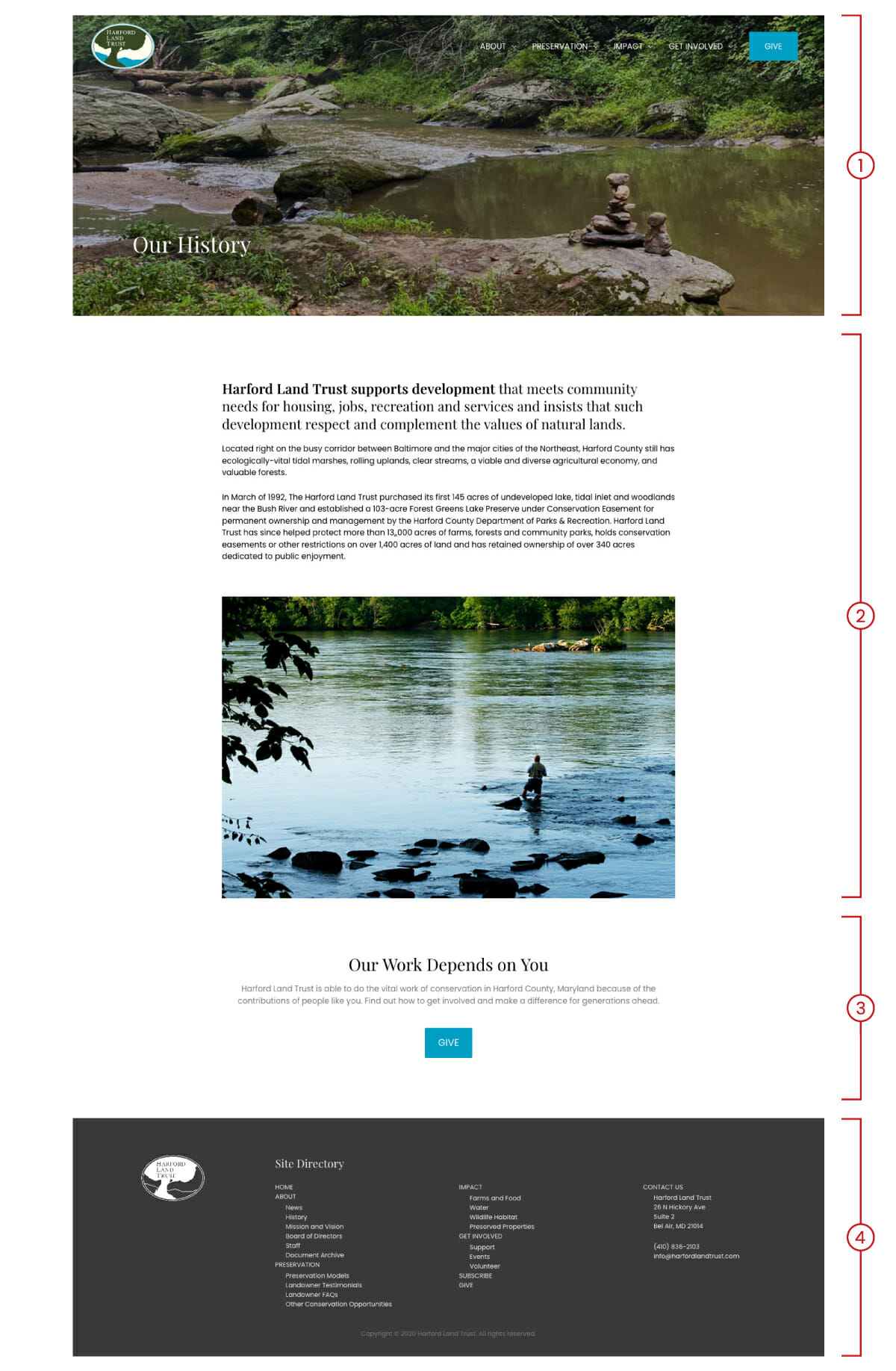
Please refer to the website user guide for further information on creating and building web pages. If you need additional assistance, you can contact the website developer.
Social Media
An important part of the brand’s social media presence is the way that the logo is displayed in the organization’s profile picture. The logo should be displayed here in a way so that the entire logo is visible. The logo should not be cropped or masked in any way. Correct displays of the logo are shown below.
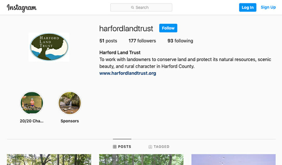
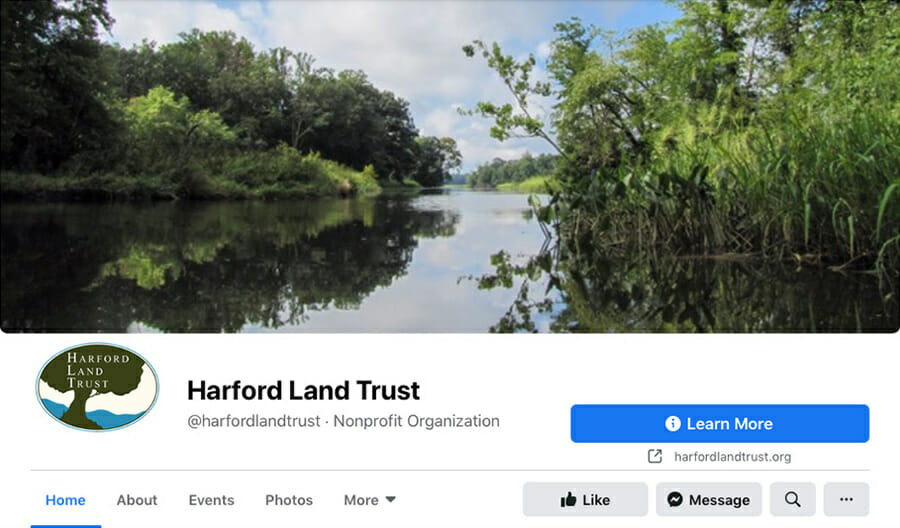
For examples of incorrect uses of the logo in social media, please refer to the document Correct Use of the Harford Land Trust Logo in Social Media Profiles (266 KB, .PDF). A logo image on a square canvas and that is optimized for social media use is provided in the downloads section at the end of this guide.
Reports and Documents
The look and layout of the organization’s reports and documents should align with the look and design of the website. Titles and headings should be set in Playfair Display, and body text should be set in Poppins. (Links to download these fonts can be found in the section on typography, above.)
When standard fonts are not available, an acceptable serif typeface (e.g., Times New Roman) and sans-serif typeface (e.g., Helvetica or Arial) may be used.
Document margins are 1.0″ top and bottom, and 1.25″ left and right. The header and footer margins are 0.5″. The organization logo is placed in the header in the top right corner and sized 0.65″. Footer text is sized 8pt and set in Poppins or comparable sans-serif type. The organization name and document name appear in the footer at the lower left corner. The page number appears in the footer in the lower right corner.
If an up-to-date copy of the report template is needed, please contact the Administrative and Outreach Coordinator.
Business Cards and Other Brand Collateral
To be completed at a later time. (Need business card for reference.)
Signage
To be completed after consulting with Kristin and Sara.
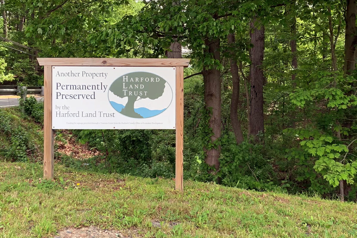
Figure 3: A Harford Land Trust sign on a preserved land site.
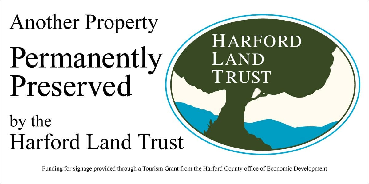
Figure 4: A sample layout of signage to be placed on a preserved land site.
Downloads and Resources
Below are a collection of resources for representing Harford Land Trust in print and online.
Print and High Resolution Logo Kit
Social Media Logo Kit
Color Standards
Further Information
For more information about using the logo or anything else in this guide, please contact Harford Land Trust by following the link below.